

Creating a Landing Page that Converts
Landing pages that convert visitors into customers at a high rate can make or break your digital marketing campaigns. Read through these steps to have the most optimal landing page formula.


Whether you’re selling products or services, having landing pages that convert visitors into leads/customers at a high rate can make or break your digital marketing campaigns. It’s much easier and more cost effective to double the conversion rate of your landing page than it is to double your traffic to that page!
The Landing Page Formula
Good landing pages tend to follow this formula:
- Headline & supporting statement
- Hero shot
- 1-2 calls to action
- Benefit & feature statements
- Social proof
- Final calls to action
Let’s now look at each of those elements in turn, and how you can improve your landing pages to convert more of those hard-earned visitors into leads and sales…
1. Headlines
Main headline should state key benefit
The main headline is the first thing a visitor will see when they arrive at your page, so it needs to clearly state the key benefit they will get from your offer. A supporting sub-headline / statement can then give further context.
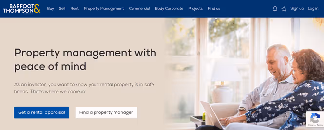
Example: Barfoot & Thompson
For Barfoot & Thompson, their property management landing page has a headline that clearly and succinctly states the key benefit to potential customers – peace of mind. The supporting statement then expands on this:
Headlines are clear, rather than clever
It’s tempting as marketers to come up with a sexy, clever slogan for your headline. But cleverness just draws attention to the cleverness itself, at the expense of communicating your actual value proposition. Clarity pushes the visitor towards converting, so always choose clarity over cleverness. Barfoots could have gone for something clever like “Your Property Is Our Home”. But instead, they chose clarity – simply stating the thing being offered (property management) and the main benefit of that thing (peace of mind).
2. Hero Shot
The top fold of your landing page (the section you can see before scrolling) should also feature a large, compelling image or video – we call this the “Hero shot”. Hero shots should:
- Dominate the page, making it clear “at a glance” what the page is about
- Work together with the headlines to reinforce each other
- If possible, show the product/service being used in context – demonstrate it in action.
Example: HelloFresh
Here’s a good example from food delivery giant HelloFresh. The hero shot is colourful and appealing, and shows the service being used in context via “before cooking” and “after cooking” images:

3. Benefit Statements
Having grabbed the visitor’s attention with your headline and hero shot, it’s time to build that interest further by stating more key features and benefits. This should be presented in a format that’s immediately easy to grasp “at a glance”. Column-style chunks or bullet points are helpful for allowing the visitor to quickly scan the benefits. Make sure there’s plenty of white space around these elements so they’re easy to read.
Example: Uber
Uber does a really nice job of this on their driver sign-up page. After their headline and hero shot, they present three more key benefits to potential drivers, in easy-to-read chunks:
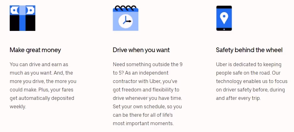
The focus of these statements should be on the benefits of your product/service, before explaining the features. The visitor will want to know what the features are, but it’s the benefits – i.e. how your product/service will solve their problem – that will persuade them to take action. In the above example, Uber says “Make great money” (the benefit) rather than “competitive fee schedules” (the feature). And they say “Drive when you want” rather than “flexible drive time options”. t’s important to state the features too of course, so that the visitor understands how that benefit will be conferred. But you should lead with the benefit to the customer first.
4. Social Proof
One of the most important elements of marketing persuasion is “social proof”. If other people trust and like your product or service, the visitor will be reassured that they’ll like it too. Common forms of social proof you can use on your landing page are:
- Testimonials from happy customers
- Logos of well-known companies who are customers
- Usage numbers (for things like software)
If customer testimonials are used, include the person’s full name, location and ideally a photo of them.
Example: HelloFresh
Here’s how HelloFresh present their testimonials:
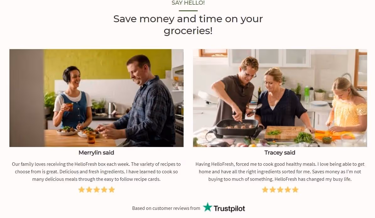
The best testimonials describe how your product/service solved a specific pain point for them. So in the second Hello Fresh testimonial above, the person states how it made them cook healthy meals (solving their pain point of wanting to be healthy) and having all the ingredients waiting for them at home (solving their pain point of not having time to go to the shops).
5. Calls To Action
Having persuaded the visitor with your headlines, hero shot, benefit statements and social proof, you then need to ask them to take action. Where should these calls to action (CTAs) be placed? In most cases, having your CTAs in the top fold AND at the bottom of the page will be best, unless the page is short enough that the entire page fits within the top fold and no scrolling is necessary.
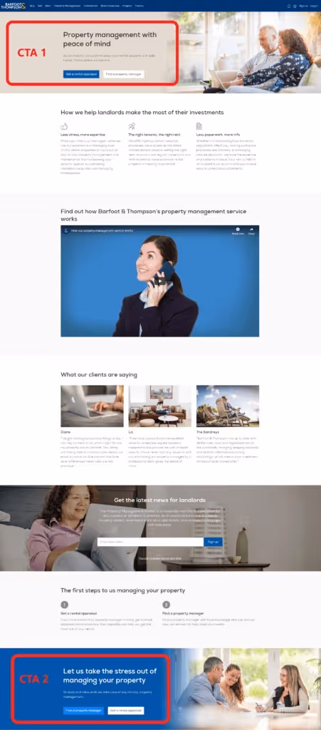
Example: Barfoot & Thompson
The Barfoot’s page we referred to above does this, with a similar CTA block at the top and the bottom:
When deciding what action to ask the visitor to take, you’ll need to balance the value of what you’re giving away with the level of information you’re asking the visitor to provide – their contact details, money etc. It’s tempting to ask for more info or commitment from your visitors, but if you ask for too much in exchange for your offer, you’ll drop conversions.
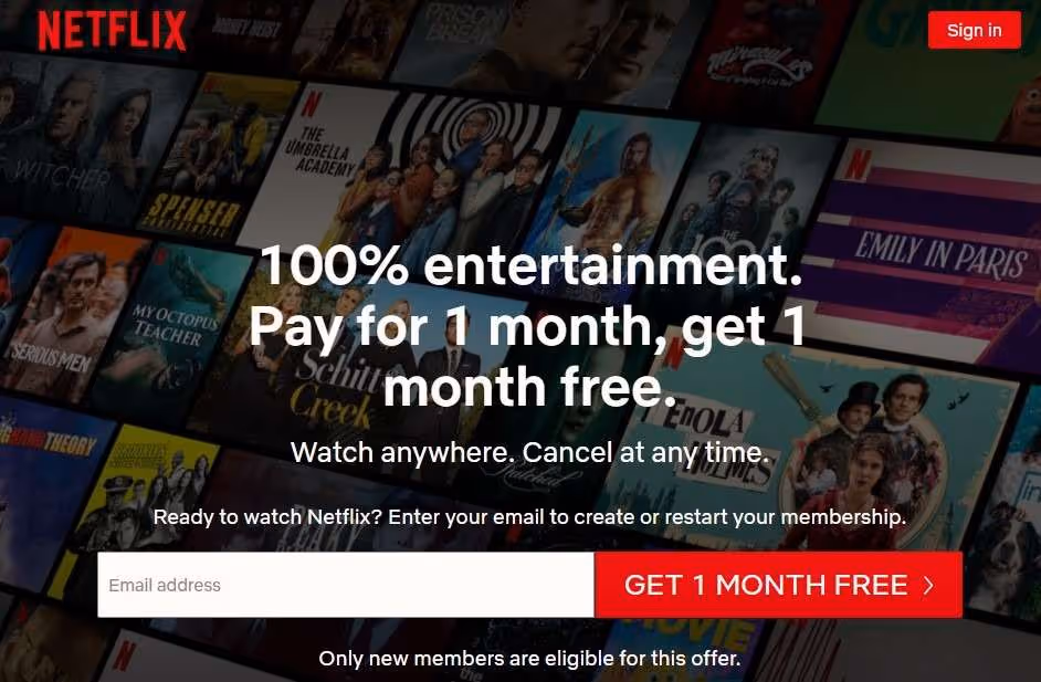
Example: Netflix
Netflix has decided that it’s fair to ask people to pay for 1 month in exchange for 1 month free, and the only thing the person needs to provide to get started is an email address:
CTA button design
When designing your CTA (call to action) buttons, there are a few key things to note:
- Colour and contrast: They need to be large enough and use contrasting colours to make it stand out from the rest of the page, and have some space around it to make it easier to see.
- Clickability: The button needs to look “clickable”, and ideally have it change slightly when you hover your mouse over it.
- Button Text: In the button copy itself, describe what will actually happen when the visitor clicks. E.g.: “Get the free eBook” or “Start Your Free Trial”, rather than abstract things like “Submit” or “Click here”.
Example: Les Mills
Les Mills have done these things well on the signup page for their home workout offering:

The yellow Start Your Free Trial button stands out from the background colours, it looks clickable, and when you roll over the button, it changes colour.
6. Lead Capture Forms
If your main call to action is to ask them to complete a signup form, it’s crucial that this is easy, fast and anxiety-free for the visitor. We see so many landing pages where these forms are an afterthought that creates friction. So try to do the following with your lead forms:
- Number of fields: Reduce the number of form fields the visitor must fill out as much possible – too many can put people off. Do you really need to gather all that information before they enter their email?
- Questions direct and easy to answer: Use clear, closed questions that the visitor can easily answer quickly. If using dropdowns, cover every possibility, or have an “other” option.
- Captcha security: If you’re using a captcha form, make sure it’s effortless to use, or remove it entirely.
- Privacy statement: Badly worded privacy policies can actually lower your conversion rate as it puts doubt into people’s minds. Don’t use the word “spam”, which can introduce anxiety that wouldn’t have otherwise existed.
7. Thank You Page
Your marketing efforts don’t need to stop on your landing page of course – there’s more available real estate on your confirmation / “thank you” page after they sign up! Consider doing one or more of the following things there:
- Upsell them something
- Ask them to follow/share on social media
- Ask them to complete a survey
- Exceed their expectations with a free bonus of some sort
- Include info/advice that didn’t fit on the landing page
- Suggest what to do next (e.g. read other website content)
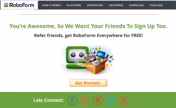
Example: Roboform
For example, rather than just a simple “thank you” message, password manager Roboform have included a referral scheme offer on their signup thank you page:
8. Further Tips
A few further tips to consider when creating your landing pages:
- Message Match: Try to ensure the messaging and imagery on your landing page (particularly the top fold) matches what you’ve used in the marketing campaigns and ads you’re running to send people there. If your landing page uses a primarily green colour scheme, don’t use a blue scheme in your display ads. If your headline says “Property management with peace of mind”, make that your ad headline too!
- Design for Mobile: Mobile traffic makes up a big proportion of visitors for most websites nowadays, but we often design our landing pages on desktop computers and forget about the mobile experience. Hand check your pages on mobile as you design them, and don’t forget to run them through Google’s mobile-friendly testing tool.
- Remove Distractions: Remove any excess navigation, excessive links to other pages on your site, or too many different calls to action. You need to simplify and streamline the experience for the visitor and propel them towards the key actions you want them to take, and having too many options can confuse and stall them.
9. Google Ads Considerations
If you’re running Google Search Ads, there are additional landing page requirements you’ll need to consider to achieve good Quality Scores (and in turn, pay less per click):
- Relevance & Originality: The page should contain only original content, not copied from other websites, be of high value to the user given the keywords they searched for, and contain the main targeted keywords in the title tag and high up in the body copy.
- Navigation: The page should make it easy for the visitor to navigate your site (including on mobile sites).
- Transparency & Trustworthiness: The page explains your products/services before asking visitors to fill out forms or share their information.
- Page load time: Encourage customers to spend time on your site by ensuring your page loads quickly. Check page speed with this tool: https://developers.google.com/speed/pagespeed/insights/
Now get started!
If you design your landing pages with all the above factors in mind, and you should see your conversion rates increase significantly. So jump in and start improving those landing pages today, and get more leads from your hard-won traffic! If you’d like any assistance with doing this, or you’d like to discuss anything else about your digital marketing, please do get in touch – we’d be happy to help.

Want instant updates when we release new blogs?
Never miss out again - sign up to our newsletter. Get the latest news, resources and marketing tips straight to your inbox. We won’t share your details or spam you. Unsubscribe anytime.